Plots#
One of the most amazing feature of hist is it’s powerful plotting family. Here you can see how to plot Hist.
[1]:
import hist
from hist import Hist
[2]:
h = Hist(
    hist.axis.Regular(50, -5, 5, name="S", label="s [units]", flow=False),
    hist.axis.Regular(50, -5, 5, name="W", label="w [units]", flow=False),
)
[3]:
import numpy as np

s_data = np.random.normal(size=100_000) + np.ones(100_000)
w_data = np.random.normal(size=100_000)

# normal fill
h.fill(s_data, w_data)
[3]:
Regular(50, -5, 5, underflow=False, overflow=False, name='W', label='w [units]')
Double() Σ=99998.0
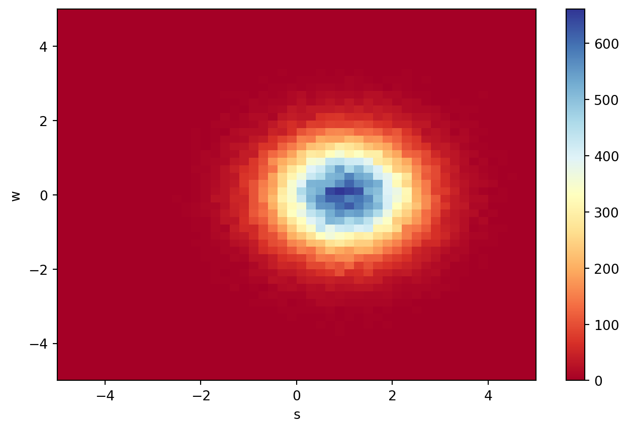
Via Matplotlib#
hist allows you to plot via Matplotlib like this:
[4]:
import matplotlib.pyplot as plt
[5]:
fig, ax = plt.subplots(figsize=(8, 5))
w, x, y = h.to_numpy()
mesh = ax.pcolormesh(x, y, w.T, cmap="RdYlBu")
ax.set_xlabel("s")
ax.set_ylabel("w")
fig.colorbar(mesh)
plt.show()
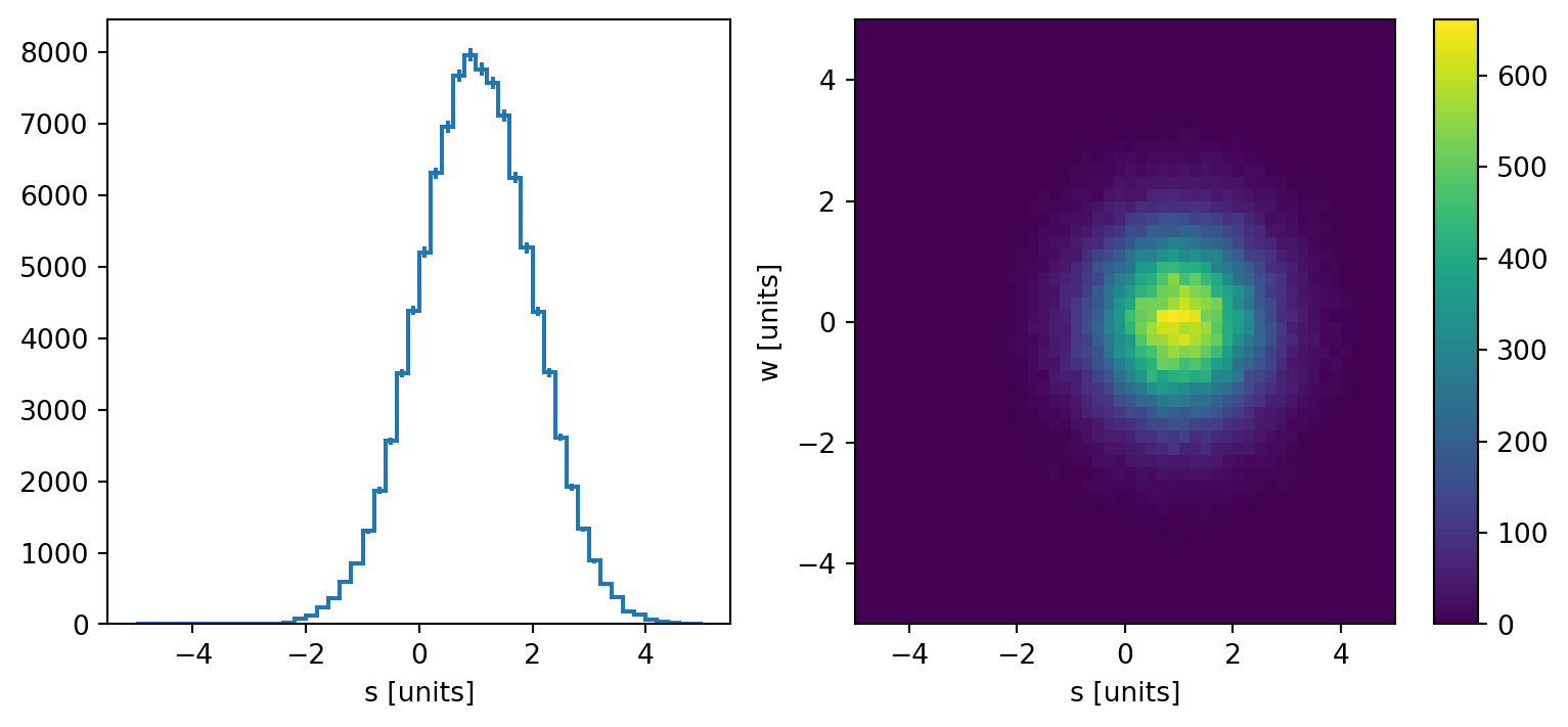
Via Mplhep#
mplhep is an important visualization tools in Scikit-Hep ecosystem. hist has integrate with mplhep and you can also plot using it. If you want more info about mplhep please visit the official repo to see it.
[6]:
import mplhep

fig, axs = plt.subplots(1, 2, figsize=(9, 4))
mplhep.histplot(h.project("S"), ax=axs[0])

mplhep.hist2dplot(h, ax=axs[1])

plt.show()
Via Plot#
Hist has plotting methods for 1-D and 2-D histograms, .plot1d() and .plot2d() respectively. It also provides .plot() for plotting according to the its dimension. Moreover, to show the projection of each axis, you can use .plot2d_full(). If you have a Hist with higher dimension, you can use .project() to extract two dimensions to see it with our plotting suite.
Our plotting methods are all based on Matplotlib, so you can pass Matplotlib’s ax into it, and hist will draw on it. We will create it for you if you do not pass them in.
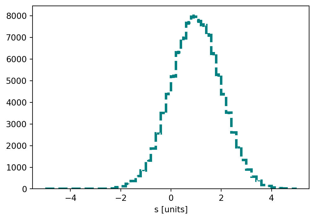
[7]:
# plot1d
fig, ax = plt.subplots(figsize=(6, 4))


h.project("S").plot1d(ax=ax, ls="--", color="teal", lw=3)
plt.show()
[8]:
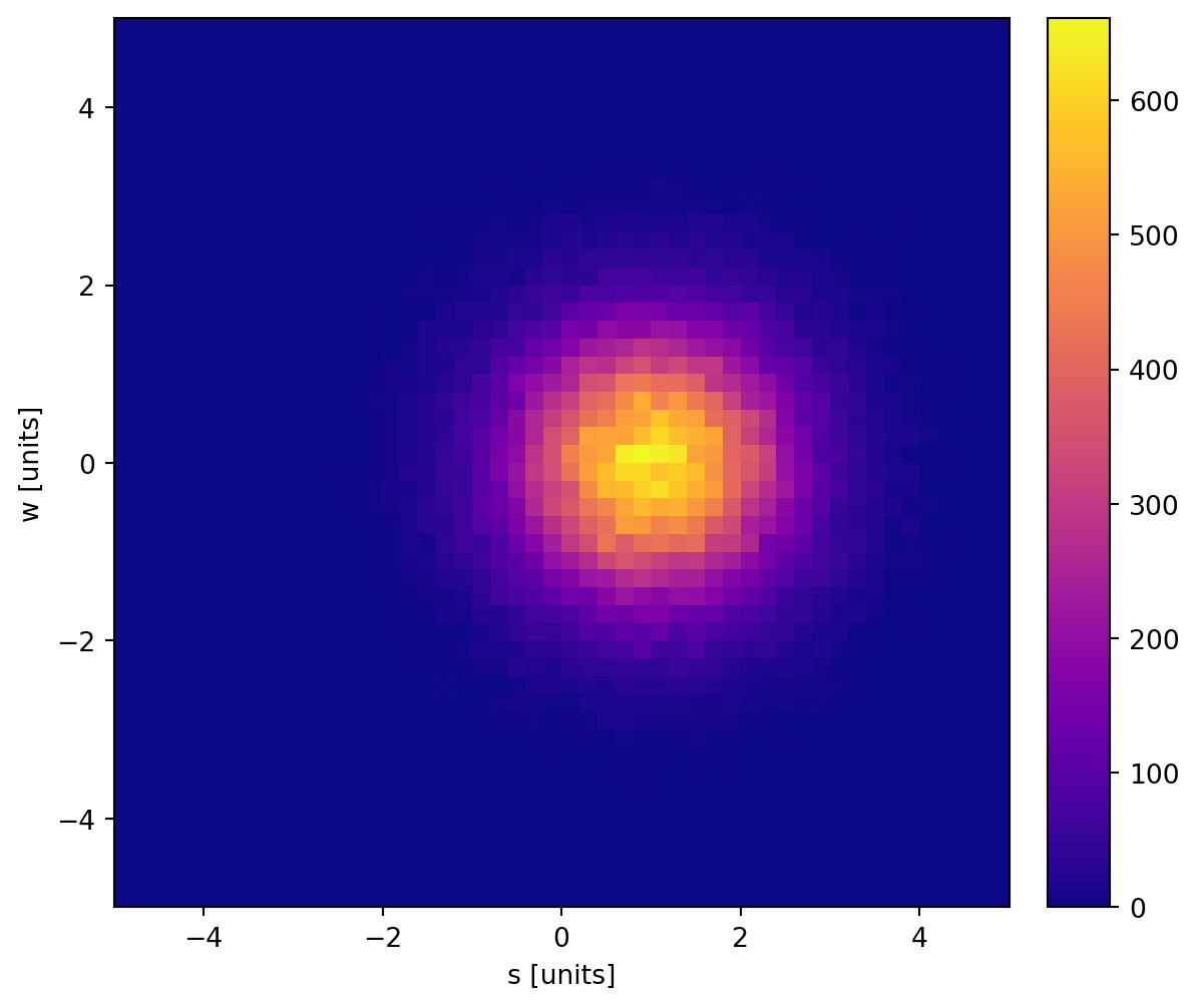
# plot2d
fig, ax = plt.subplots(figsize=(6, 6))

h.plot2d(ax=ax, cmap="plasma")
plt.show()
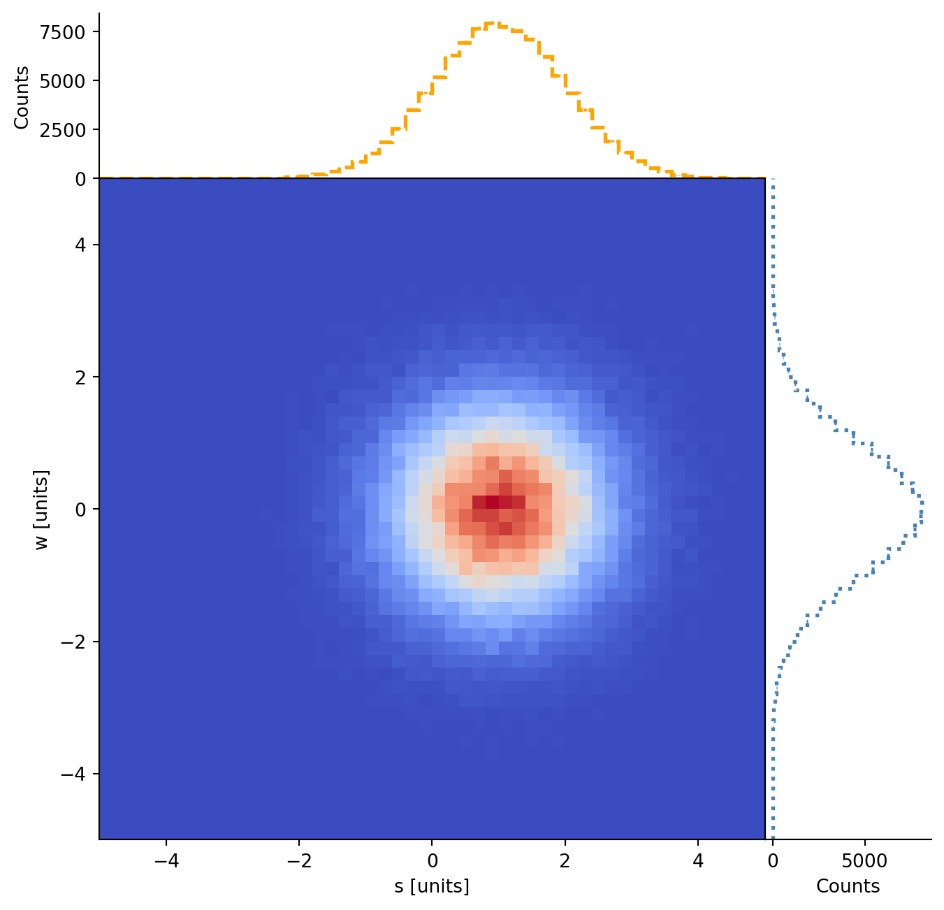
[9]:
# plot2d_full
plt.figure(figsize=(8, 8))

h.plot2d_full(
    main_cmap="coolwarm",
    top_ls="--",
    top_color="orange",
    top_lw=2,
    side_ls=":",
    side_lw=2,
    side_color="steelblue",
)

plt.show()
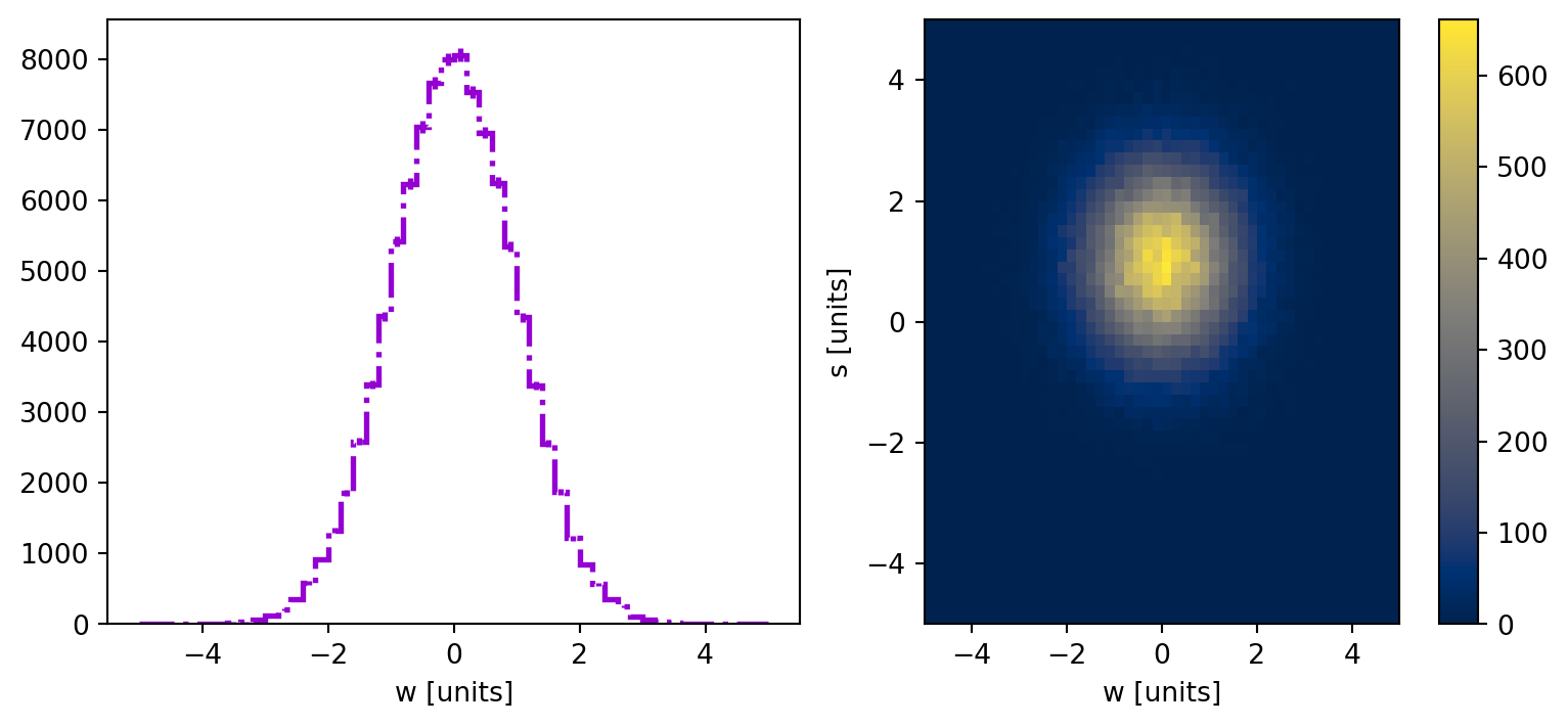
[10]:
# auto-plot
fig, axs = plt.subplots(1, 2, figsize=(9, 4), gridspec_kw={"width_ratios": [5, 4]})


h.project("W").plot(ax=axs[0], color="darkviolet", lw=2, ls="-.")
h.project("W", "S").plot(ax=axs[1], cmap="cividis")

plt.show()
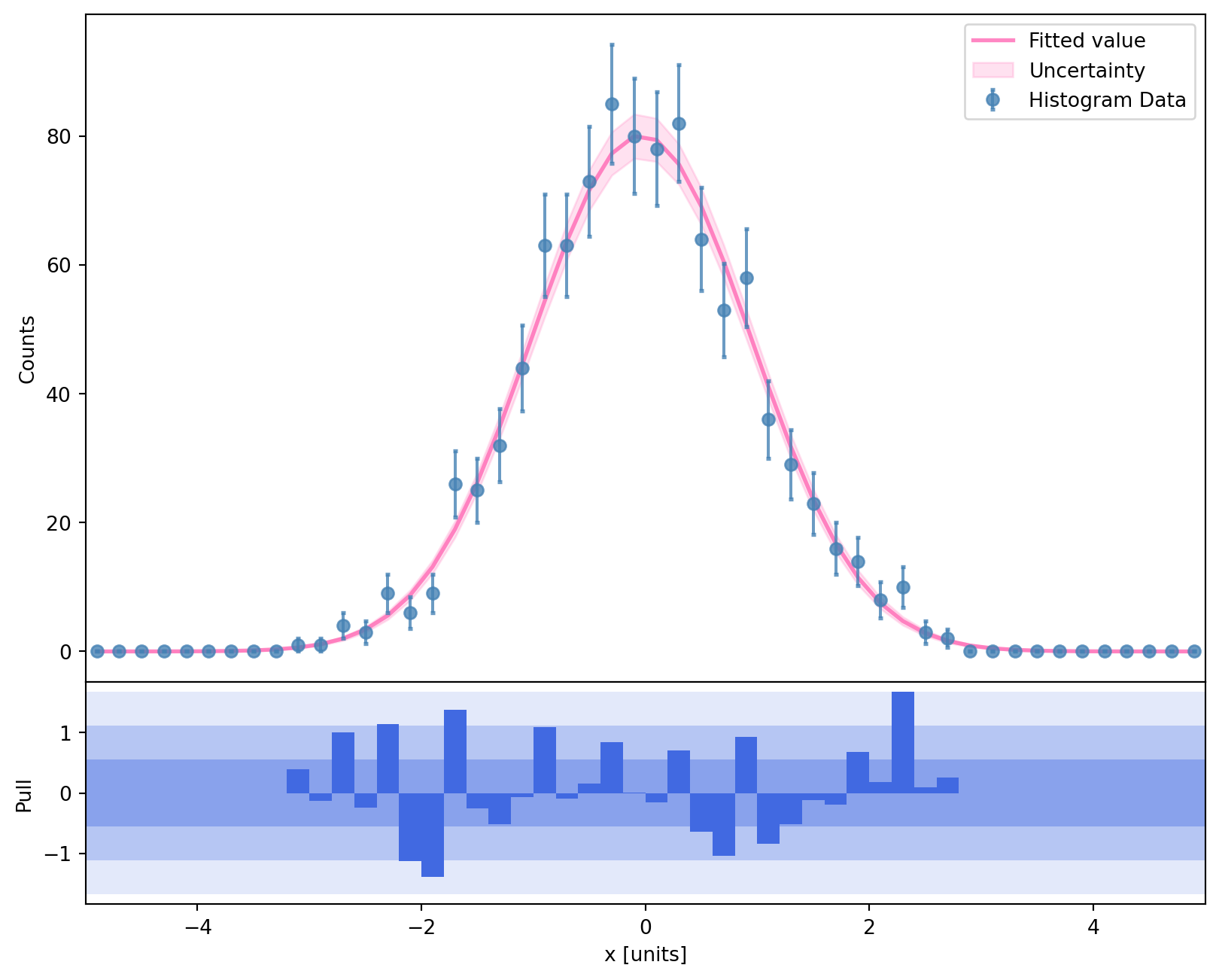
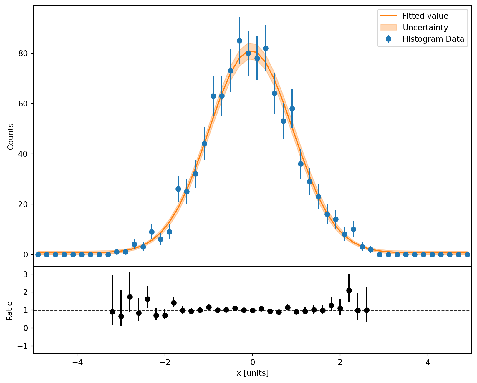
Via Plot Pull#
Pull plots are commonly used in HEP studies, and we provide a method for them with .plot_pull(), which accepts a Callable object, like the below pdf function, which is then fit to the histogram and the fit and pulls are shown on the plot. As Normal distributions are the generally desired function to fit the histogram data, the str aliases "normal", "gauss", and "gaus" are supported as well.
[11]:
def pdf(x, a=1 / np.sqrt(2 * np.pi), x0=0, sigma=1, offset=0):
    return a * np.exp(-((x - x0) ** 2) / (2 * sigma**2)) + offset
[12]:
np.random.seed(0)

hist_1 = hist.Hist(
    hist.axis.Regular(
        50, -5, 5, name="X", label="x [units]", underflow=False, overflow=False
    )
).fill(np.random.normal(size=1000))

fig = plt.figure(figsize=(10, 8))
main_ax_artists, sublot_ax_arists = hist_1.plot_pull(
    "normal",
    eb_ecolor="steelblue",
    eb_mfc="steelblue",
    eb_mec="steelblue",
    eb_fmt="o",
    eb_ms=6,
    eb_capsize=1,
    eb_capthick=2,
    eb_alpha=0.8,
    fp_c="hotpink",
    fp_ls="-",
    fp_lw=2,
    fp_alpha=0.8,
    bar_fc="royalblue",
    pp_num=3,
    pp_fc="royalblue",
    pp_alpha=0.618,
    pp_ec=None,
    ub_alpha=0.2,
)
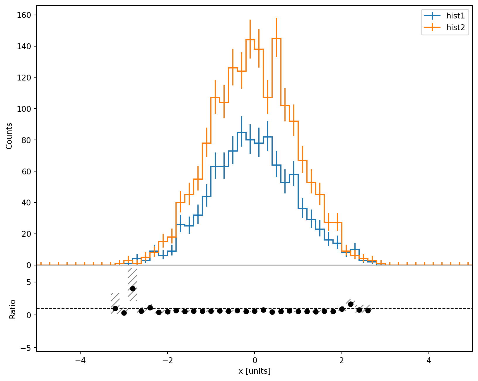
Via Plot Ratio#
You can also make an arbitrary ratio plot using the .plot_ratio API:
[13]:
hist_2 = hist.Hist(
    hist.axis.Regular(
        50, -5, 5, name="X", label="x [units]", underflow=False, overflow=False
    )
).fill(np.random.normal(size=1700))

fig = plt.figure(figsize=(10, 8))
main_ax_artists, sublot_ax_arists = hist_1.plot_ratio(
    hist_2,
    rp_ylabel=r"Ratio",
    rp_num_label="hist1",
    rp_denom_label="hist2",
    rp_uncert_draw_type="bar",  # line or bar
)
Ratios between the histogram and a callable, or str alias, are supported as well
[14]:
fig = plt.figure(figsize=(10, 8))
main_ax_artists, sublot_ax_arists = hist_1.plot_ratio(pdf)
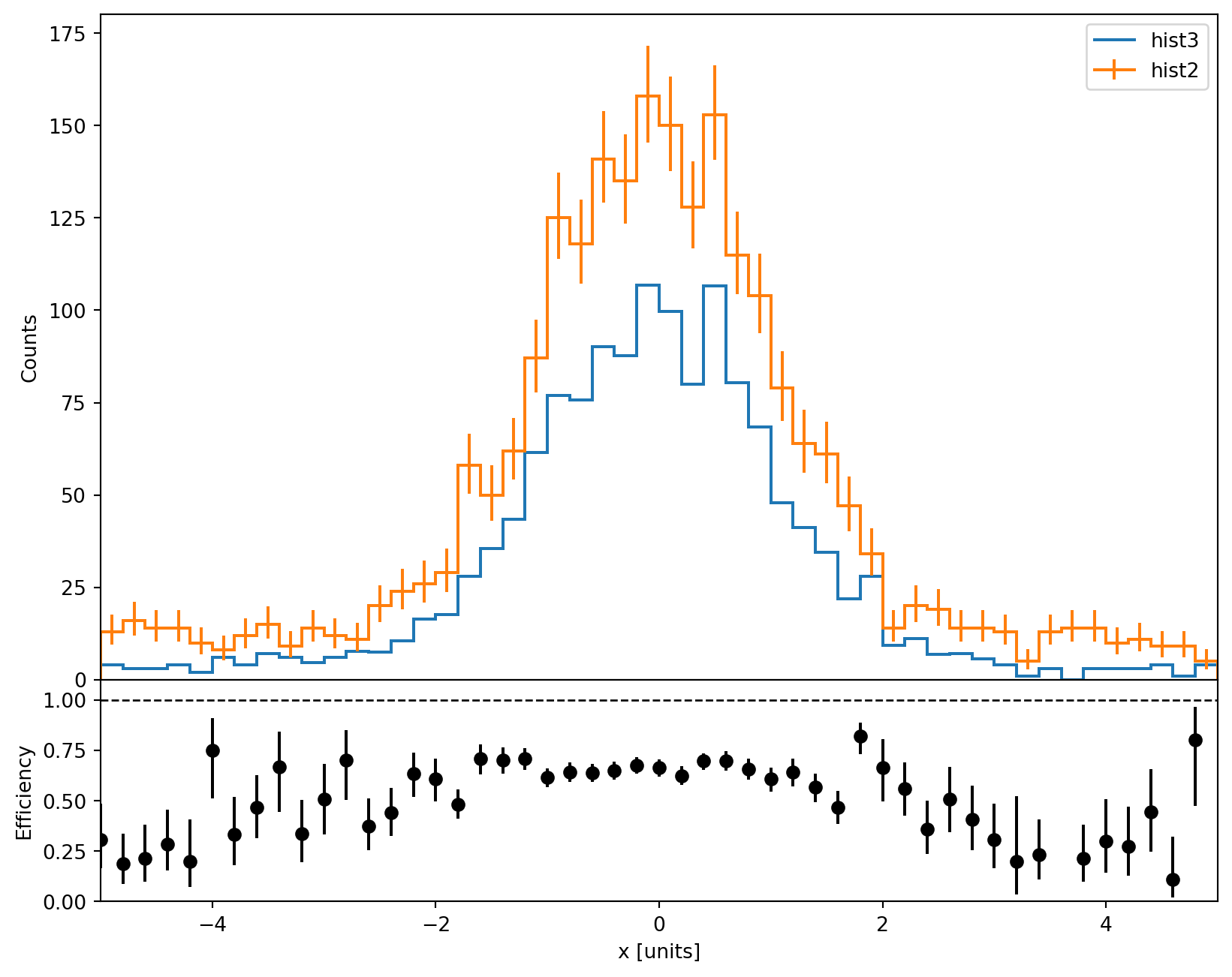
Using the .plot_ratio API you can also make efficiency plots (where the numerator is a strict subset of the denominator)
[15]:
hist_3 = hist_2.copy() * 0.7
hist_2.fill(np.random.uniform(-5, 5, 600))
hist_3.fill(np.random.uniform(-5, 5, 200))

fig = plt.figure(figsize=(10, 8))
main_ax_artists, sublot_ax_arists = hist_3.plot_ratio(
    hist_2,
    rp_num_label="hist3",
    rp_denom_label="hist2",
    rp_uncert_draw_type="line",
    rp_uncertainty_type="efficiency",
)